
Conversion optimization aligns visual layout, checkout ergonomics, and page speed to turn storefront traffic into completed orders.
Your ecommerce theme directly influences if visitors buy or leave. Conversion optimization is the process of increasing the percentage of visitors who complete a purchase, and your theme is the foundation of that process.
Baymard Institute reports that 70.19% of shoppers abandon their carts – often due to friction your theme can eliminate. The right design choices, features, and performance benchmarks can reverse that trend.
What Is Conversion Optimization?
Conversion optimization modifies an e-commerce storefront’s visual hierarchy, navigation flow, and checkout architecture to maximize the proportion of visitors who complete purchases. Strategic optimizations systematically eliminate decision fatigue, build merchant trust, and accelerate transaction completion across desktop and mobile devices.
Conversion optimization is the process of increasing the percentage of website visitors who complete a desired action, such as making a purchase, signing up for a newsletter, or adding items to a cart.
Your conversion rate directly impacts revenue, since a 1% increase in conversions can generate thousands of dollars in additional sales without increasing traffic costs.
Your ecommerce theme influences sales by shaping user experience through page load speed, mobile responsiveness, and navigation structure, all of which determine if a visitor stays or leaves.
Why Conversion Rate Matters
Conversion rate directly dictates e-commerce profitability by determining the revenue generated from existing marketing traffic and advertising spend. Increasing your baseline conversion rate from two to three percent yields a fifty percent increase in total store sales without raising advertising budgets.
Success in ecommerce depends on more than driving traffic to your store – it depends on converting that traffic into paying customers.
Tracking micro conversions, running funnel analysis, and applying behavioral targeting reveal where shoppers drop off. Cohort retention data measures lifetime value over time, showing you which customer segments generate sustainable revenue if you optimize each stage strategically.
How Ecommerce Themes Influence Sales
Themes govern store speed, visual hierarchy, mobile usability, and checkout efficiency, directly shaping customer purchase confidence at every touchpoint. A clunky, slow-rendering theme causes immediate cart abandonment, whereas a streamlined template turns casual browsers into high-value repeat buyers.
Your ecommerce theme directly controls how shoppers perceive, navigate, and buy from your store.
Visual consistency builds brand storytelling by aligning colors, fonts, and imagery across every page.
Microinteractions impact purchasing decisions when hover effects and animations guide attention.
Emotional triggers activate buying behavior, increasing conversions by 23% if you apply cultural localization to regional audiences.
Key Conversion Elements
The primary conversion elements of an online store include distraction-free product pages, sticky checkout bars, intuitive category navigation, and prominent trust badges. Optimizing these structural components guides shoppers through the purchasing funnel effortlessly while reducing friction at every decision point.
| Conversion Component | Psychological Principle | Recommended Practice | Implementation Mistake | Average Lift |
|---|---|---|---|---|
| Sticky Add-to-Cart Bar | Reduces cognitive friction | Anchor to bottom on mobile, top on desktop | Obscuring reviews or product text | +8% to +15% |
| Distraction-Free Checkout | Removes exit opportunities | Strip headers, footers, and sidebars | Leaving full navigation links in checkout | +14% to +22% |
| Slide-Out AJAX Mini Cart | Maintains shopping momentum | Include free shipping progress bar & checkout CTA | Redirecting to a separate cart page | +6% to +12% |
| Verified Trust Signals | Risk aversion reduction | Place guarantee badge directly below CTA | Generic pixelated security icons | +5% to +10% |
Your ecommerce store’s conversion rate depends on 4 key elements: homepage layout, product page design, navigation and user path, and checkout experience.
The fundamental elements of e-commerce conversion include streamlined navigation, high-contrast CTA buttons, and transparent product specifications.
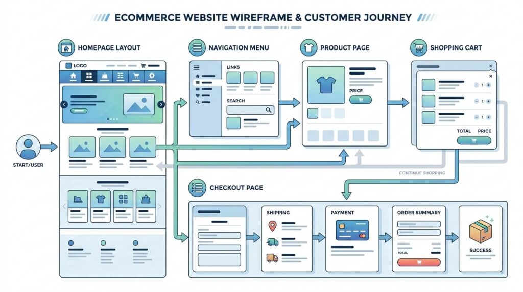
A well-structured homepage captures attention within 3 seconds, while optimized product pages – featuring high-resolution images, clear pricing, and persuasive CTAs – drive purchase decisions.
You’ll increase completed transactions by up to 35% if you streamline your checkout experience and reduce navigation friction across the customer path.
Homepage Layout
An effective homepage layout immediately communicates brand value, highlights bestselling collections, and directs visitors into specific category funnels. Clean promotional banners and intuitive search bars help shoppers find relevant products within five seconds of landing on your storefront.
The homepage layout determines if visitors stay or leave within the first 3 seconds of landing on your site. Optimize these 5 elements to boost conversions:
- Place above fold offers to capture immediate attention
- Use responsive hero images to drive visual engagement
- Add testimonial carousels to build social proof
- Prioritize search prominence for product discoverability
- Streamline utility navigation to reduce friction
Product Page Design
High-converting product page design pairs high-resolution zoomable photography with clear pricing, variant selectors, and an unmissable add-to-cart button. Prominent shipping estimates, return guarantees, and customer reviews eliminate purchase hesitation right beside the primary buy trigger.
Once your homepage captures a visitor’s attention, your product page must convert that interest into a purchase. Use high-resolution imagery with interactive zoom to showcase details.
Tell variant storytelling through color and size options. Display social proof, including verified reviews and star ratings, prominently.
Clearly state your return policy to eliminate purchase hesitation, increasing conversions by up to 35%.
Streamlined navigation minimizes click depth by organizing deep product catalogs into logical multi-column mega menus and faceted category filters. Helping customers find specific items within three clicks significantly reduces bounce rates across desktop and handheld smartphone shopping sessions.
Streamlined navigation directly increases ecommerce conversion rates by reducing the steps between product discovery and checkout.
Your theme’s architecture should support intuitive path mapping through:
- Breadcrumb trails clarifying category hierarchies
- Micro interactions confirming user actions visually
- Progressive disclosure revealing product details incrementally
- Search relevance surfacing exact product matches
- Clear CTAs accelerating checkout completion
Checkout Experience
The checkout experience must eliminate navigation distractions, support one-tap digital wallets like Apple Pay, and offer auto-completing address inputs. Minimizing checkout form fields and displaying security compliance seals prevents last-second cart abandonment during final payment authorization.
Checkout abandonment costs ecommerce stores an average of $18 billion in lost revenue annually, making your checkout flow one of the highest-utilize conversion points in your entire store.
Enable guest checkout, display progress indicators, and activate address autofill to reduce friction. Integrating mobile wallets like Apple Pay increases completion rates by 34%.
Visible order summaries reduce buyer hesitation before final purchase confirmation.
Design Elements That Increase Conversions
Design elements that increase store conversions include high-contrast call-to-action buttons, scannable typographic hierarchies, intentional white space, and clear color psychology accents. Aligning visual styling with shopper expectations focuses attention on high-margin products and eliminates visual clutter.
Your store’s design elements – CTA button colors, typography, and white space – directly influence conversion rates, with studies showing that optimized button colors alone can increase clicks by up to 34%.
Call-to-action button colors must establish high visual contrast against background containers to guide customer purchase decisions.
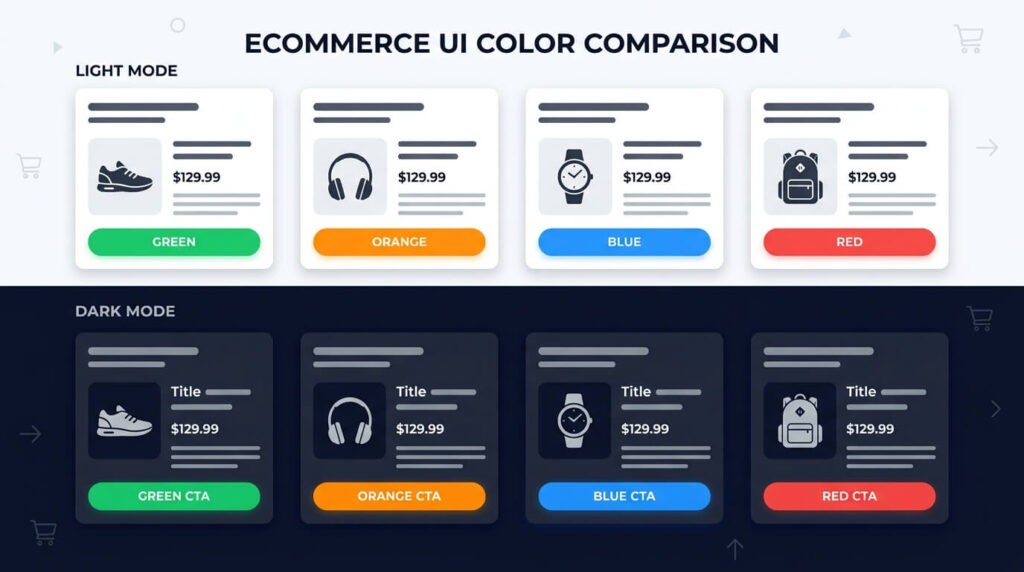
High-contrast color combinations, such as a white CTA button on a dark background, improve readability and guide users toward purchase actions.
You’ll also want to align your brand colors with color psychology principles, since colors like red and orange trigger urgency while blue builds trust, and balanced visual hierarchy reduces cognitive load by organizing content from most to least important.
CTA Button Colors
Call-to-action button colors must provide stark visual contrast against your theme’s background palette to capture immediate shopper attention. High-contrast shades like bright orange, green, or bold blue establish visual dominance and guide users toward the primary purchase action.
CTA button colors directly influence click-through rates, with studies showing that a high-contrast button color can increase conversions by up to 21% compared to a low-contrast alternative.
- Run contrast testing between button and background colors
- Meet accessibility contrast ratios of 4.5:1
- Apply microinteraction color shifts on click events
- Optimize CTA placement using heatmap data
- Enable hover animation to signal interactivity
Color Psychology & Brand Colors
Color psychology strategically utilize hues to evoke specific buyer emotions, such as blue for corporate reliability, green for organic health, and orange for energetic affordability. Maintaining a cohesive palette prevents brand confusion and reinforces merchant professionalism across all templates.
Color psychology shapes purchasing decisions by triggering specific emotional responses – blue builds trust, red creates urgency, and green signals safety or approval.
Your emotional branding strengthens when seasonal palettes, cultural associations, and accent psychology align with your core identity.
Prioritize accessibility contrast ratios of 4.5:1 minimum to ensure readability across all users, including those with visual impairments.
High-Contrast Color Combinations
High-contrast color pairings, such as dark charcoal text over pure white containers, maximize readability and reduce eye fatigue for mobile shoppers. Ensuring compliant contrast ratios between buttons and background elements guarantees accessibility across diverse smartphone screen resolutions.
High-contrast color combinations – such as black text on a white background or white text on a dark navy button – increase readability and direct user attention to key conversion points like CTAs, pricing, and form fields.
- High contrast accessibility ensures WCAG 2.1 compliance
- Vibrant accenting highlights CTAs using complementary palettes
- Readability testing validates contrast ratios above 4.5:1
- Emotional arousal increases 20% with bold color pairings
- Complementary palettes strengthen visual hierarchy across pages
Typography & Readability
Typographic readability requires clean sans-serif typefaces, generous line spacing, and minimum sixteen-pixel body text sizes across all store templates. Clear text formatting allows customers to scan product specifications, ingredient panels, and sizing charts effortlessly without zooming.
Typography directly impacts ecommerce conversion rates, with studies showing that legible, well-structured text increases purchase intent by up to 20%.
You’ll boost readability by applying strategic font pairing, maintaining 50 – 75 character line length, and conducting readability testing across devices.
Responsive typography adapts seamlessly to screen sizes, while accessibility contrast ratios meeting WCAG 2.1 standards ensure your content reaches all 1.3 billion users with visual impairments.
White Space & Visual Hierarchy
Intentional white space isolates critical product cards, pricing indicators, and purchase buttons, preventing cognitive overload during browsing sessions. Establishing a disciplined visual hierarchy directs shopper focus directly toward key value propositions and promotional store announcements.
White space and visual hierarchy are the two design elements that most directly increase ecommerce conversion rates, with strategic spacing shown to boost conversion rates by up to 20% and clear visual hierarchy reducing cognitive load by 40%.
Optimize your store’s layout using:
- Negative space to isolate CTAs
- Visual balance through symmetrical grid systems
- Content grouping to cluster related products
- Focal points directing buyer attention
- Structured grids organizing page flow
Conversion Features in Ecommerce Themes
High-converting e-commerce themes include built-in sticky add-to-cart drawers, AJAX slide-out carts, dynamic urgency badges, and verified buyer review carousels. These native conversion utilities eliminate the need for heavy external third-party apps that slow down mobile store rendering speeds.
Ecommerce themes built on conversion-focused frameworks include specific features – sticky add-to-cart buttons, quick-view modals, Ajax cart drawers, product badges, and trust signals – that reduce friction and keep shoppers moving toward checkout.
Shopify themes like Dawn and Turbo, for example, embed mobile-first layouts that adapt product pages for the 79% of smartphone users who browse and buy on handheld devices.
You’ll increase your store’s conversion rate when you select a theme that combines these built-in tools rather than adding them through third-party apps that slow page load speed.
Sticky Add-to-Cart
Sticky add-to-cart drawers remain anchored to the viewport as shoppers scroll through extensive product specifications and photo galleries. Persistent button visibility eliminates scrolling fatigue and lets customers buy immediately whenever purchase conviction occurs.
Optimizing product page layouts demands clean photography, accessible variant pickers, and persistent add-to-cart buttons.
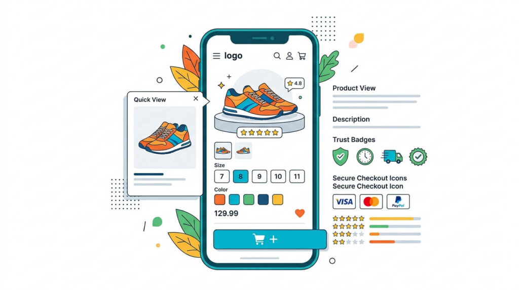
A sticky add-to-cart button remains fixed on the screen as shoppers scroll through a product page, keeping the purchase action accessible at all times without requiring users to scroll back to the top.
Your theme’s floating cart and persistent CTA reduce friction effectively when you implement:
- Scroll-triggered visibility activation
- Exit intent purchase prompts
- Microinteraction feedback animations
- Persistent mobile bottom-bar placement
- Dynamic quantity adjustment controls
Quick View & Ajax Cart
Quick view modals and slide-out AJAX carts allow shoppers to inspect item specifications and update quantities without triggering disruptive full page reloads. This seamless interaction loop accelerates multi-item browsing and expands overall average cart basket sizes.
Quick view and Ajax cart features let shoppers browse products and add items to their cart without full page reloads, reducing checkout abandonment by keeping users in their shopping flow.
Product previews display instant add-to-cart buttons within modal windows, while microinteractions feedback confirms selections visually.
Support keyboard shortcuts for accessibility considerations, ensuring users steering via assistive technologies complete purchases efficiently.
Product Badges
Visual product badges highlight limited stock, bestseller status, free shipping eligibility, and seasonal clearance discounts directly on catalog thumbnails. These subtle visual triggers establish gentle urgency and guide customer interest toward high-margin inventory items.
Product badges – visual labels like “Best Seller,” “New Arrival,” “Low Stock,” and “Sale” – increase conversion rates by up to 55% by triggering urgency and social proof directly on product cards.
You’ll boost purchases faster when you apply these badge types:
- Limited editions marking exclusive, time-restricted products
- Seasonal markers highlighting holiday or trend-specific items
- Eco labels certifying sustainable, environmentally verified products
- Social proof displaying verified buyer ratings
- Award icons showcasing industry-recognized certifications
Trust Signals
Prominent trust signals include SSL security padlocks, money-back satisfaction guarantees, verified customer review ratings, and recognizable payment processor logos. Reassuring first-time shoppers regarding transaction safety and refund policies significantly lowers cart abandonment during checkout.
Trust signals – security badges, SSL certificates, money-back guarantees, and verified customer reviews – increase ecommerce conversion rates by 42% by reducing purchase hesitation at critical decision points.
| Trust Signal | Conversion Impact |
|---|---|
| Secure checkout badges | +18% completions |
| Third-party certifications | +12% trust clicks |
| Social proof reviews | +23% add-to-carts |
| Trust badges | +15% checkouts |
| Customer reviews | +31% purchases |
Mobile-First Design
Mobile-first design prioritizes thumb-friendly touch targets, responsive image carousels, and persistent bottom checkout drawers on smartphone viewports. Optimizing mobile usability guarantees smooth navigation and checkout for the seventy percent of shoppers browsing on cellular phones.
Designing ecommerce themes with mobile-first principles increases conversion rates by 30% by prioritizing thumb-friendly navigation, fast-loading product pages, and streamlined single-page checkouts for smartphone users.
- Apply responsive typography for readable product descriptions
- Optimize touch targets to 44×44 pixels minimum
- Enable offline caching for uninterrupted browsing
- Use progressive enhancement to load core features first
- Position thumb-friendly navigation within 75px of screen edges
How to Optimize Your Theme for Higher Conversions
Optimizing your theme for higher conversions requires accelerating mobile page speed, streamlining checkout forms, eliminating superfluous header links, and displaying prominent trust guarantees. Continuous A/B testing of product layouts and button placements ensures ongoing revenue growth as customer preferences evolve.
Optimizing your ecommerce theme for higher conversions requires four targeted actions: improving page speed, simplifying navigation, refining product pages, and reducing checkout friction.
Google research shows that a 1-second delay in mobile load time reduces conversions by up to 20%, so compress images, minify CSS and JavaScript, and enable browser caching to keep load times under 3 seconds.
You’ll also want to streamline your navigation menu to fewer than 7 categories, display high-resolution product images with zoom functionality, and eliminate unnecessary checkout steps, such as forced account creation, to move shoppers from product discovery to purchase completion.
Optimizing themes for higher conversions requires removing navigation friction and providing seamless mobile checkout transitions.
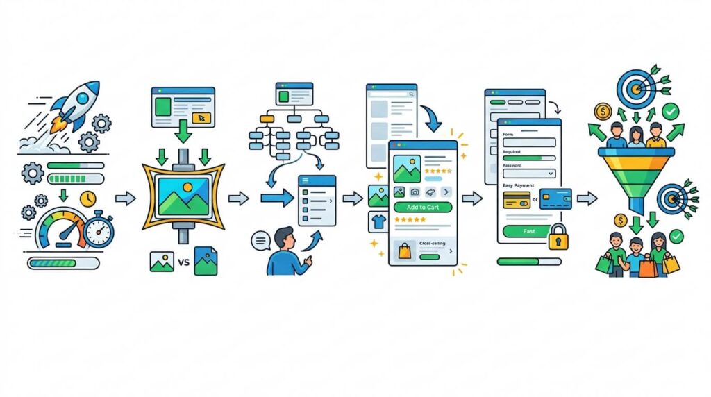
Improve Page Speed
Accelerating page speed involves minifying asset payloads, preloading critical fonts, compressing images into WebP, and enabling server-side page caching. Eliminating render-blocking delays directly satisfies Google Core Web Vitals thresholds and reduces mobile customer bounce rates.
Page speed directly impacts your ecommerce conversion rate – Google data shows that a 1-second delay in mobile load time can reduce conversions by up to 20%.
Optimize your theme using these 5 techniques:
- Enable lazy loading for images
- Implement caching strategies for static assets
- Apply asset minification to CSS and JavaScript
- Configure server tuning for faster response times
- Prioritize critical rendering of above-the-fold content
Simplifying navigation requires pruning bloated menu hierarchies, consolidating redundant categories, and integrating predictive AJAX search bars. Clear departmental paths enable shoppers to discover desired products quickly, keeping customer drop-off rates low across deep catalog archives.
Simplified navigation reduces cart abandonment by guiding shoppers to products faster – Baymard Institute research shows that 18% of users abandon ecommerce sites due to poor navigation and layout.
Implement mega navigation for large catalogs, menu categorization for product grouping, and breadcrumb simplification for clearer pathways. Prioritize search prominence and filter optimization to help shoppers locate specific items faster.
Optimize Product Pages
Optimizing product pages demands positioning high-resolution media, transparent delivery timelines, and customer review star ratings directly above the digital fold. Removing distracting sidebar widgets keeps user attention focused entirely on product selection and purchase completion.
Your product pages directly influence purchase decisions, converting browsers into buyers when they present the right combination of visuals, copy, and trust signals.
- Display customer reviews prominently beneath product titles
- Use variant photography showing each color, size, or style
- Write meta descriptions under 160 characters targeting buyer intent
- Position upsell placement directly below the add-to-cart button
- Apply price anchoring by showing original prices beside discounts
Reduce Checkout Friction
Reducing checkout friction requires supporting guest checkouts, integrating one-click payment gateways, and displaying real-time shipping calculations early in the cart. Eliminating unexpected surcharges and lengthy account creation hurdles accelerates final payment completion noticeably.
Friction at checkout causes 70% of shoppers to abandon their carts, so streamlining each step – from cart review to payment confirmation – directly increases completed purchases.
Enable guest checkout, autofill support, and form validation to accelerate completion.
Add progress indicators so shoppers track remaining steps.
Display social proof – verified reviews, trust badges, secure payment icons – to reinforce confidence during checkout.
Best Ecommerce Themes for Conversion Optimization
The best e-commerce themes for conversion optimization prioritize sub-second loading speeds, distraction-free checkout flows, and native sales triggers. Proven performers like Booster for Shopify and Shoptimizer for WooCommerce consistently lead the industry in average conversion rates and checkout completions.
Shopify and WooCommerce offer conversion-optimized themes that directly impact your store’s sales performance.
Shopify themes like Turbo and Booster include built-in features such as fast load speeds, mobile-first layouts, and streamlined checkout flows, while WooCommerce themes like Flatsome and Astra Pro provide drag-and-drop customization, A/B testing compatibility, and conversion-focused design elements.
You’ll see measurable improvements in click-through rates and cart completions if you select a theme built specifically around reducing friction in the buying process.
Shopify Themes
Leading conversion-oriented Shopify themes like Booster and Dawn utilize native Online Store 2.0 sections, liquid rendering optimizations, and built-in sales triggers. Their lightweight asset architecture eliminates third-party app dependencies, delivering lightning-fast mobile checkouts that maximize sales.
The best Shopify themes for conversion optimization include Debutify, Booster theme, and Dawn, each built with speed, mobile responsiveness, and structured product layouts that reduce purchase friction.
- Theme customization aligns visual identity with brand standards
- Theme accessibility ensures compliance with WCAG 2.1 guidelines
- Theme localization supports multilingual and multi-currency selling
- Theme analytics tracks visitor behavior and conversion funnels
- Theme scalability handles increased traffic without performance loss
WooCommerce Themes
High-performance WooCommerce themes like Shoptimizer and Astra incorporate dedicated conversion tools, distraction-free checkout layouts, and sticky add-to-cart drawers. These templates minimize database query overhead, delivering fast mobile performance that turns shopping traffic into completed orders.
WooCommerce themes built for conversion optimization include Flatsome, Astra, and OceanWP, each offering drag-and-drop page builders, lightweight code architecture, and checkout-optimized layouts.
These themes support mobile optimization, SEO tactics, and market segmentation tools to target specific customer groups.
You can also integrate subscription models for customer retention, converting one-time buyers into recurring revenue streams through automated billing and personalized membership tiers.
Frequently Asked Questions About Conversion Optimization
Conversion rate optimization frequently generates questions regarding average e-commerce benchmarks, button color psychology, mobile checkout drop-offs, and theme speed impacts. Below are clear, data-backed answers addressing the most common conversion challenges facing contemporary e-commerce store operators.
What is a good e-commerce conversion rate?
An average e-commerce conversion rate ranges between two and three percent, while top-performing optimized storefronts achieve conversion rates exceeding five percent. Achieving higher conversions depends on rapid mobile loading speeds, intuitive navigation, and frictionless checkout flows.
An average e-commerce conversion rate ranges between two and three percent, while top-performing optimized storefronts achieve conversion rates exceeding five percent.
How does theme speed affect conversion rates?
Theme speed directly governs conversion rates, with Google research proving that a one-second delay in page load time reduces mobile conversions by up to twenty percent. Rapid page rendering keeps shoppers engaged and prevents frustrated drop-offs.
Theme speed directly governs conversion rates, with Google research proving that a one-second delay in page load time reduces mobile conversions by up to twenty percent.
Which theme features drive the highest conversions?
Sticky add-to-cart buttons, slide-out AJAX mini carts, prominent trust badges, and distraction-free checkout templates drive the highest conversion gains. Native implementation prevents external script bloat and ensures consistent, reliable functionality on all mobile devices.
Sticky add-to-cart buttons, slide-out AJAX mini carts, prominent trust badges, and distraction-free checkout templates drive the highest conversion gains.
How does mobile responsiveness impact checkout completions?
Mobile responsiveness eliminates zooming, misclicks, and broken form fields, allowing smartphone shoppers to complete checkouts smoothly. Streamlining mobile touch targets and offering one-tap digital wallets like Apple Pay reduces mobile cart abandonment rates substantially.
Mobile responsiveness eliminates zooming, misclicks, and broken form fields, allowing smartphone shoppers to complete checkouts smoothly.
The most effective add-to-cart button color is one that provides maximum contrast against your store’s primary background palette, typically bright orange, vibrant green, or royal blue. High visual contrast draws immediate shopper focus to the purchase trigger.
The most effective add-to-cart button color is one that provides maximum contrast against your store’s primary background palette, typically bright orange, vibrant green, or royal blue.
To further optimize your store performance, review our guide to the fastest e-commerce themes and read our detailed analysis of theme speed optimization to maximize your revenue growth.

Abdullah Prem is the founder of EcommerceThemes.org and BloggersNeed.com. He specializes in reviewing Shopify themes, WooCommerce themes, WordPress themes, hosting, plugins, and SaaS tools. Through EcommerceThemes.org, he publishes in-depth theme reviews, product comparisons, buying guides, and performance analyses to help ecommerce businesses choose the right theme based on speed, SEO, customization, user experience, and overall value. His goal is to provide research-driven recommendations that help store owners make informed decisions when selecting an ecommerce theme.